
The Product
A mobile ordering app for a local bakery that is by the train station and center of the town
The Problem
Commuters have a hard time getting their orders on time. They stress about missing their train to the city and being late for work. Locals find it frustrating to wait while their order is being prepared
The Goal
The goal was to create a mobile ordering app that would allow users to place orders beforehand and track them live, assuring the customer of fast and easy pickup
Software
Role
Lead UX designer / Visual DesignerResponsibilities
Designing the app, Prototyping, Responsive website, Testing, User flow design, User research, WireframingResearch Methodologies
Understanding the user
- User research
- Personas
- Problem statements
- User journey maps
User Research
Preliminary Survey
I conducted interviews and created empathy maps to further understand the future users of the app and their pain points so I could design to solve their needs. Commuters and busy clients don’t have time to wait for their orders to be prepared.
To evaluate the new order/pickup app for Martine’s, I relied on usage metrics in conjunction with two usability tests. This allowed me to gain a deeper understanding by combining qualitative and quantitative information. Although users could get through the ordering, they continued to struggle with editing their selections once they were placed in the cart. Discussions with users revealed that oftentimes, deleting an item was not easy even though it was possible, but difficult the first time we tested the app.
Insight
This user group confirmed assumptions that commuters and locals alike will get frustrated about the time that it took employees of Martine’s Bakery to get their orders ready. Research also revealed that the users were unhappy with the quality of their order when it was placed over the phone and preferred ordering through an app.
User Research | Pain Points
Commuters don’t have time to wait for their orders to be prepared
Platforms for ordering food are not equipped with live/trackable technology to know the exact status of an order
Customers need their orders to be warm when picking up
Accessibility is not an option in most food ordering apps
User Journey Map
The goal was to understand the user’s pain points. In order to do this, I focused on the main issue which was pre-ordering a meal so that it was ready to pick up when the user arrived at the bakery.
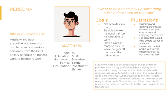
Persona: Matthew
Goal: Pre-order breakfast
| Action | Action 1 | Action 2 | Action 3 | Action 4 | Action 5 |
|---|---|---|---|---|---|
| Task List | Tasks A. Browse products B. Sort food by category C. Search for product(s) needed | Tasks A. Scroll through products B. Select products C. Click “add to Cart” | Tasks A. Input credit card info B. Click Place Order | Tasks A. Click on “Confirm Order” | Tasks A. Receive confirmation B. Receive pick-up time/location C. Travel to Martine’s |
| Feeling Objective | Eager Inquisitive | Excited optimistic | Enthusiastic Annoyed | Excited Hopeful | Satisfied Relieved Excited |
| Improvement Opportunities | Ability to select multiple products from different categories at once | Ability to edit and customize order without going back to categories | Ability to store payment info | None | Allow selection of specific “Pick-up” time |
Starting the design
- Paper wireframes
- Digital wireframes
- Low-fidelity prototype
- Usability studies
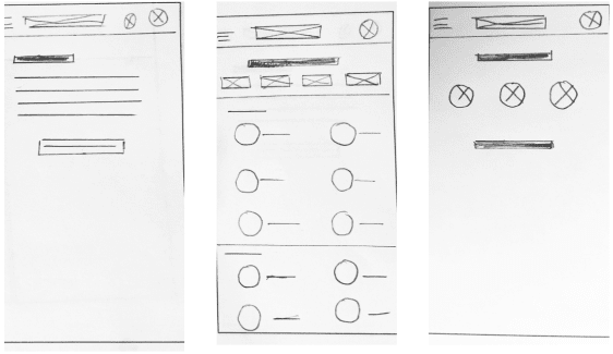
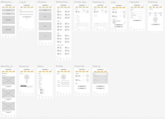
Paper Wireframes
Goals:
- Build an App that is intuitive and easy to use
- Solve user’s pain points when it comes to tracking food orders
Thought process:
- Identify key pain points
- Address those pain points and learn more about what users need/want in order to build a successful App
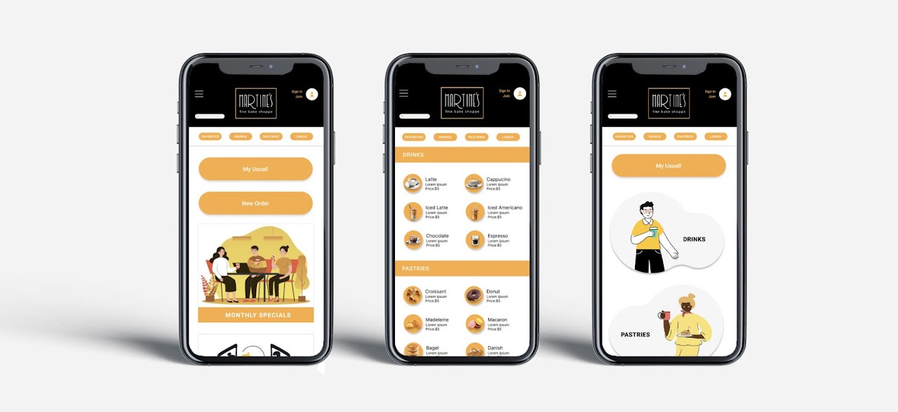
Digital Wireframes
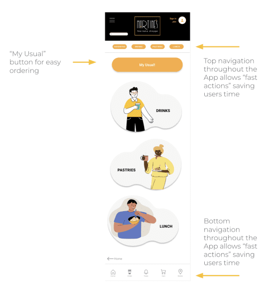
Building a “My Usual” button was a way of addressing the user’s pain point of being able to place a usual order in an effective and fast way
Digital Wireframes
Goals:
Saving users time
Thought process:
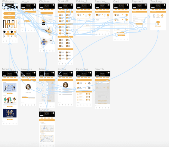
In order to save users time, we built a bottom navigation with the most common actions as well as a top navigation for easily identifying different pages in the app
Low-Fidelity Prototype
The goal was to understand the user’s pain points. In order to do this, I focused on the main issue which was pre-ordering a meal so that it was ready to pick up when the user arrived at the bakery.
Usability Study Findings
I conducted usability studies that helped me understand the users and their needs.
Round 1 findings
- Users need to order meals fast and have easy access to their usual orders
- Users liked tracking the status of their orders
- Users prioritize their time
Round 2 findings
- Users need a “My Usual” Button. Hierarchy should be illustrated with shape (buttons) and color
- Simple graphics help users identify actions
- Users use navigation menus intuitively
Refining the design
- Mockups
- High-fidelity prototype
- Accessibility
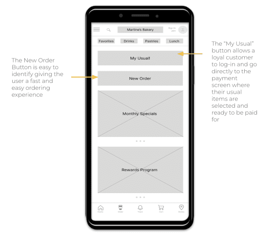
Mockups
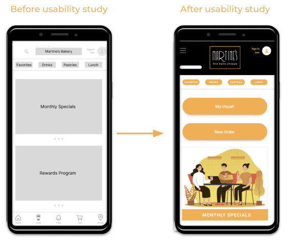
Early designs included a small top navigation for the possible actions, but based on the insights from the usability study, I made changes to improve the site’s flows. One of the changes that I made was adding “My usual” “My Usual” and “New Order” buttons in the home page front and center.
Mockups
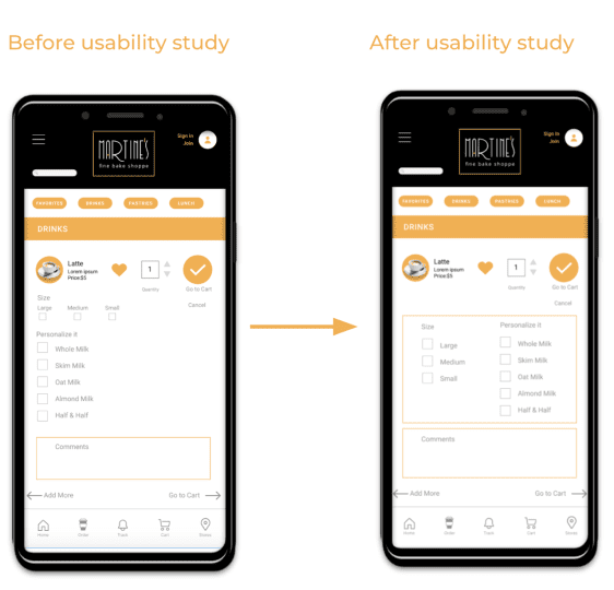
The second usability study reflected difficulty with identifying the sector where the drink size was selected. In order to solve this issue I consolidated the “Personalization” and “Drink Size” sections.
Mockups
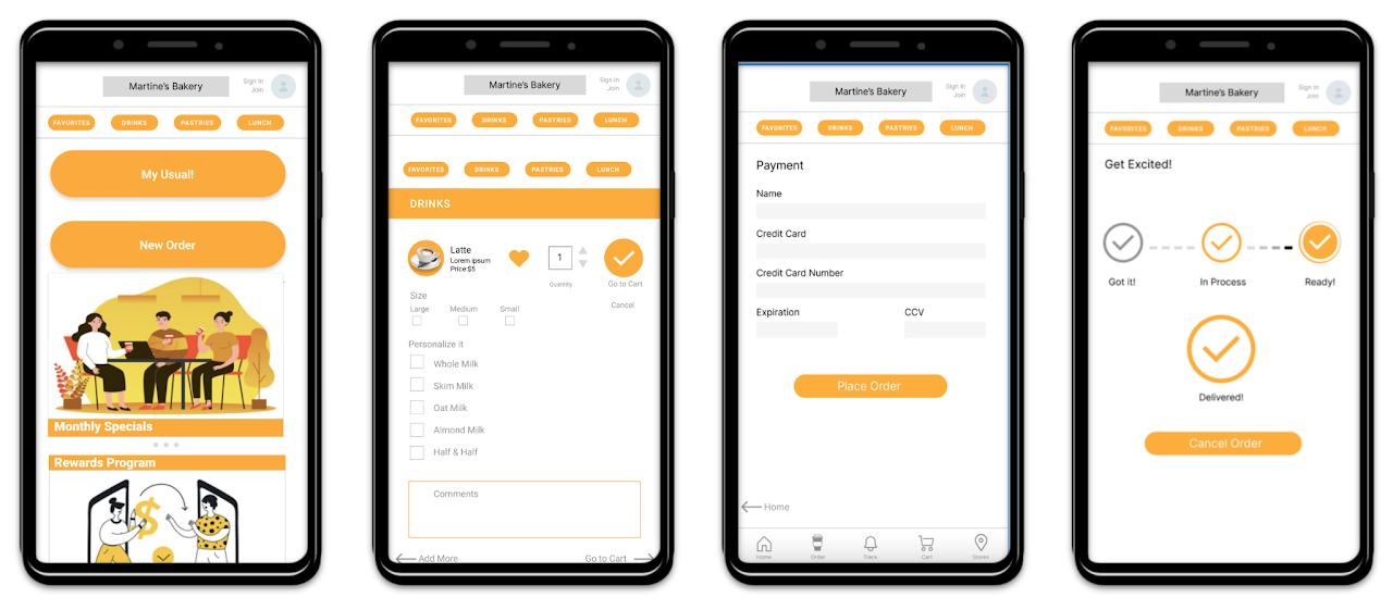
Hi-Fidelity Prototype
Accessibility Considerations
Contrast was checked on WebAIM for contrast and readability access. Images were chosen for better understanding of the products offered for purchase.
Accessibility was considered when designing buttons and hierarchy to make navigation easier.
This app will be available in various languages.
Going forward
- Takeaways
- Next steps
Takeaways
IMPACT
The Martine’s Bakery Ordering App was designed to fulfill the user’s needs and resolve their pain points. This app will benefit commuters who are rushed but also all locals who want to pre-order a meal.
WHAT I LEARNED
Throughout the project, I learned that user-centered products are built with lots of thought and care. Apps that are accessible to all users are a winning strategy for all businesses. The steps followed to accomplish a successful product are methodic and thought-out, hopefully bringing users a solution to their problems and an enyoyable experience.
Next Steps
I will be offering the App to my local bakery and conducting more user research to validate user pain points.
I will be adding a “Commuter -Lunch to go” menu to the App. Martine’s Bakery competes with coffee shops like Starbucks and Dunkin Donuts but they are missing a business opportunity which is to sell lunch to their commuter customers.
This App will help Martine’s Bakery expand their business as well as help customers purchase meals with ease. I will conduct research on how to expand the app to better serve other customers and their pain points always focusing on building a user friendly app that is intuitive and effective