BA OBRA was a campaign that the Province of Buenos Aires launched with the goal of making citizens aware of the work that the governor was doing for the province. The problem was that in polls, people couldn’t name or remember anything that had changed in their city or town since Mr. Sciolli stepped up as governor.
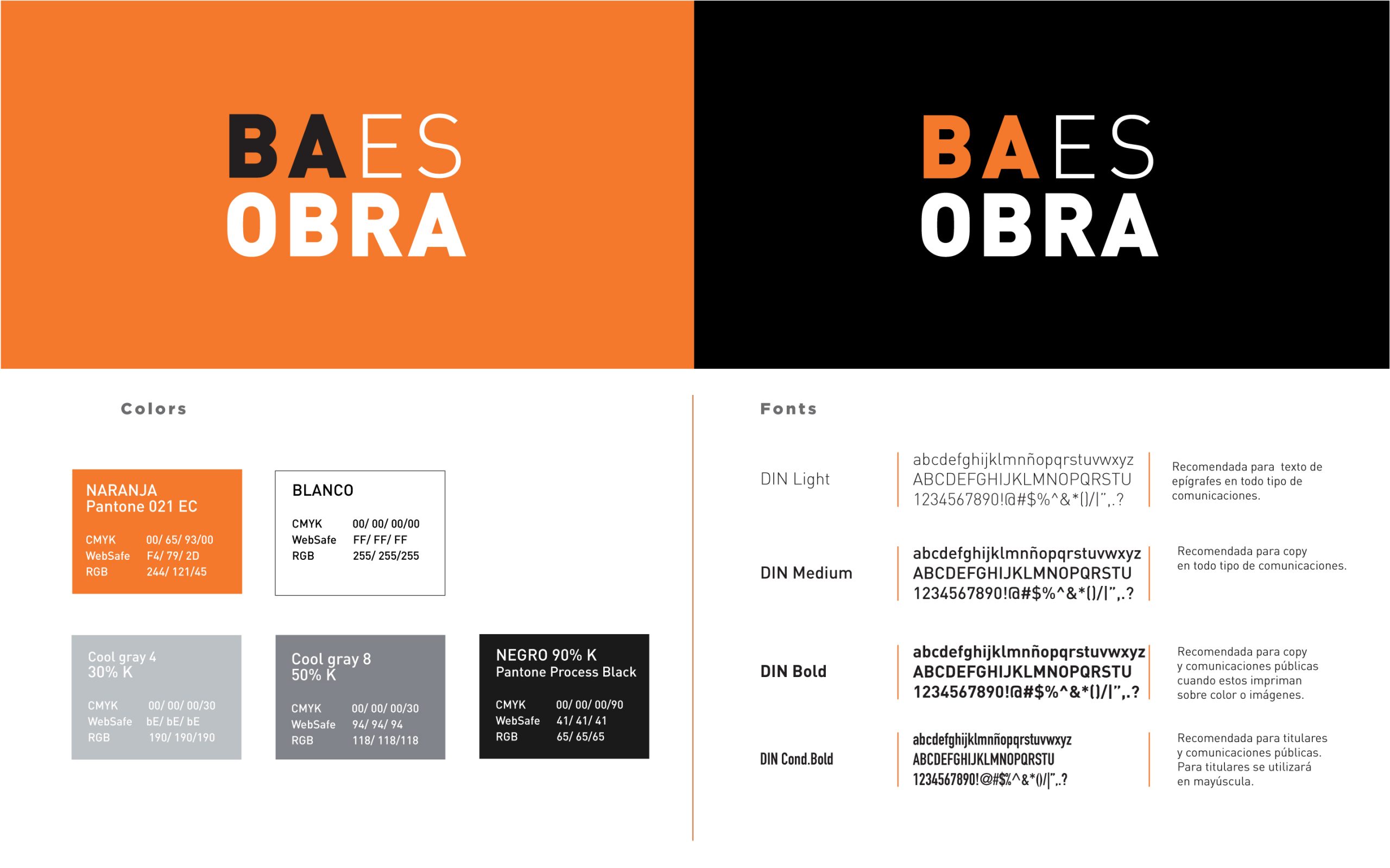
The brand identity was build as a response to the governor’s work being unnoticed. BA means Buenos Aires, ES=IS and OBRA means work.
The selection of the color orange was due to the association that we make as it relates to people working (orange cones to mark the beginning of road work, orange posters to warn of people working at a site or street, etc).
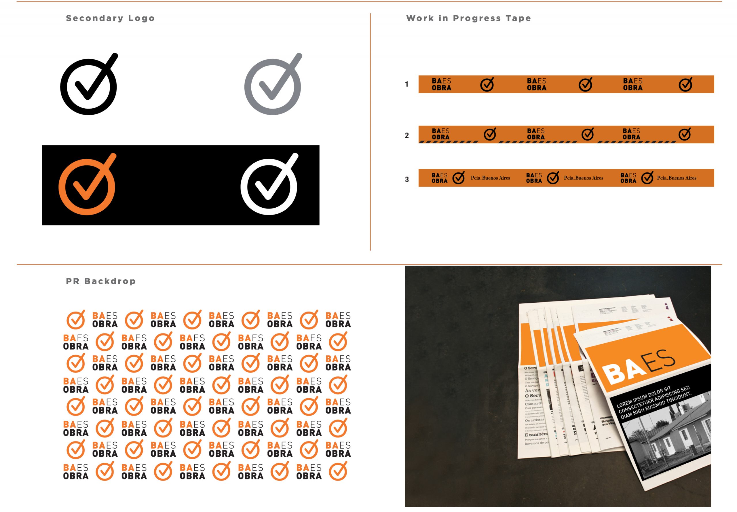
The check mark was the element that was used to represent “done”. The goal was to make citizens aware of what was being “done”. This check mark became one of the most recognized elements and was associated with the governor easily after a few months of implementing the brand. The brand system worked successfully and even though the governor did not win a second term, his “like-ability” went up by a 30% and polls recorded a 100% brand recognition .